my 27″ iMac from Epicentre MBS

nickpan's 27" iMac
my new 27" iMac

Never did I guess I would get a desktop ever again. But with my old MacBook Black in 2007 and MacBook Air in 2009, the 2011 me wanted more power with a bigger screen. I got the new 27″ iMac. FTW!

Was told by friends that the iMac is due for refresh and I waited. I waited. I waited. Apple.com announced casually that the iMac is refreshed, news spread on twitter, then Epicentre announced it on their Facebook wall on 3rd May 2011.

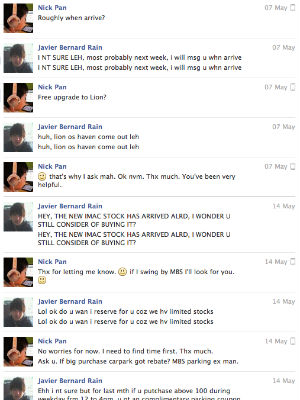
On 7th May I got a Facebook message from Bernard from Epicentre MBS. He asked me if I wanted to be notified when they have stock for the new iMac. Yeah sure I thought, helps me from monitoring. A week later he kept his word.

Facebook Customer Service from Epicentre

Not only did he help me reserve stock, he even helped me check if I could get complimentary carpark if I made a big purchase at MBS. With such good customer service, I had to buy it from him and I did so the very next day.

While carrying the 13.6 kg machine to my car, I asked him if he was involved in the Epicentre Facebook page. He wasn’t. He was just a salesman who was interested in his company’s Facebook Page on his off day, saw an opportunity to provide customer service and did. He closed a sale and made a customer happy.

Dear sales people all over the world, this is retail sales in 2011.

Just for my record:

  • 27″ iMac (June 2011)
  • S$2,748
  • 27″ LED TFT 2560 x 1440
  • 3.1GHz quad-core Intel Core i5
  • 4GB (two 2GB) of 1333MHz DDR3 memory
  • 1TB (7200 rpm) HDD
  • AMD Radeon HD 6970M 1GB of GDDR5 memory
  • Two Thunderbolt ports
  • Wireless Keyboard
  • Magic Mouse
  • Wi-Fi
  • 13.8kg

Say hello to productivity. ;)

Fast, Good and Cheap is Possible

White on White clock

Clients always want their projects to be Fast, Good and Cheap and the standard response would be to pick two. This is an especially good guiding principle to safe guard the hardworking individuals who are working their butts off to make ends meet and to have fair rates.

So The Fast, Good and Cheap Pricing Method suggests:

  • Good + Fast = Expensive
  • Good + Cheap = Slow
  • Fast + Cheap = Inferior

I think the above is quite self explanatory, but you can throw in the idea that every aspect is relative and read on to let me screw with your mind further.

Personally I think in some cases Fast, Good and Cheap might be possible just be adding an additional ingredient “Trust”.

The problem with Fast

In web projects we can’t run away from project milestones. There are stages where critical approvals are required from the client, so as to move into the next stage of a project. This is most commonly practised in projects that uses the Waterfall Model.

However, have you ever thought that the clients who are not web practitioners or online professionals are the ones that are actually grading your work. They are the ones who look at what you have done and sometimes say the most amazing things. They clearly do not trust their vendors professional advise. This back and forth of revisions, debate on subjective design, on how blue is blue, how big the logo should be, how its-just-not-right-yet, usually kills the “Fast” aspect of the Fast, Good and Cheap possibility.

The problem with Good

In a similar way, clients’ perception of good is also very subjective. They usually want to control how things are done at times, they feel that they are getting something fully customise hence some clients want to play the creative director, the art director, the copy writer, the technologist too at times. These clients clearly don’t trust their vendors professional advise. So the final delivery could be great in the eyes of the client, but a stab in the creative heart of the designer. On the flip side, some award winning work could be hated by the clients. This explains why so many award winning works are pro bono.

Again if the client left it to the web professionals and the web professionals really dive in and understand the clients’ business, this could be another matter. Respect is earned and trust is gained.

The problem with Cheap

Every business wants to reduce their cost as much as possible as business are FOR PROFIT. When clients are asked “what’s your budget”, at times you get the “I have no budget” or “I have very little budget” or “I don’t have much, but if your idea is great, i’ll go get more budget” type response. Very normal.

I believe every project have a budget. Its basically how much you are comfortable to spend on what you are gonna get. So personally I find price is not the issue, the issue is with value. Problem is do you really know what you gonna get from a web project if you need help in the first place?

Example

Lets just say a property agent wants to setup something online to help his business and have not much, say $500 budget, what could he do? He goes and find a web designer and says “I want a website, it should allow me to showcase the properties that i’m marketing. I need a CMS with photo gallery functionality, social sharing, SEO, web hosting at the minimum. So please give me a proposal tomorrow as i need it within a few weeks”. When asked about budgets, the vague answers as shared above are well articulated.

With a very stereotypical mindset, I think the following could be possible responses.

  • Large Digital Agency – This guy is a one man show. He does not have the budget. Why are we even wasting our time talking to him.
  • Small Web Design Company – Sounds like a good project. That guy knows what he wants. Lets give him a quote based on the requirements. SGD$10k quote sent. Client replies with a “you must be kidding, i can get someone good to do it for under $1k”. Small Web Design Company curses all freelancers.
  • Freelancer – Provides a quote for SGD$2k and can’t commit on timeline. Client and Freelancer haggles for 2 weeks over emails. Conversation fades away like how a crescent moon slowly disappears.
  • Web Savvy Property Agent – I need to invest in my business, but I need something simple. All I really need is something online to showcase the properties that i’m marketing. He setups a Flickr Pro account, upload his photos, buys a domain and points to it and he is done in 2 hours at Starbucks on a Monday afternoon. He thinks he is worth $100/hr. So ($100 x 2hrs) + (USD$24.95 Flickr Pro for 1 year) + ($20 .com domain name registration) + ($6.50 Venti Latte) = lesser than $500 budget and it only took 2hrs.

So what went wrong?

The Small Web Design Company thinks $10k is fair. The freelancer thinks if $2k is not cheap enough he better go get a job. The Web Savvy Property Agent did not get what he wanted, but what he have now is something valuable for his business.

Maybe not too great an example, but you get the drift.

I’m glad I recently met a client who just told me out right, “I have 50k, what can you do for me?”. I love it how business is business, no foreplay required.

Fast + Good + Cheap + Trust

So, if you are a client and you are trying to engage a web professional for some help on your online initiatives, have a clear brief, work out how much you think this possible-online-thing is valued. Speak to web people and see who can bring most value to the table. If they have earned your trust, just let them do their magic. You may think, what if they screw up? What if there is someone else better? I like how the Cheshire Cat told Alice who did not know which road to take “Then it doesn’t matter which way you go”.

So, if you are a web professional, prove your worth and think for your client. What do they really need? Bring value to the table, let them know they are in good hands and show them how you understand web design is not as important as their business + mean it. You may just earn their trust and they may just say “I have a million dollars, what can you do for me?”.

ps: btw, if you do have 1million to do something online, i can be reached at nick(at)nickpan(dot)com ;)

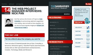
The Web Project Manager Interview

Got interviewed recently by TheSambarnes which is a unique Web Project Management website. They have previously interviewed people like Brett Harned who is Senior Project Manager at Happy Cog in US, Dean Flynn Program Director at IE from Melbourne, Martin Crockett Senior Project Manager / Producer at Pirata London in the UK and more.

Want to read how to someone who started in the toilet business ended up in web project management? Then read the next in the Web Project Manager Interviews series, this time with Nick Pan, Director of Projects and Qais Consulting, who says with regards to new project opportunities “…you’ve got to know when to hold ’em and and when fold ‘em.”
Read the full article »

If web is your day gig, I’ll love to get some feedback from fellow peers.

SGGovCamp 2011 and Open Data

SGGovCamp 2011
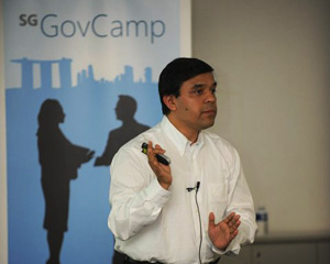
Photo by Preetam Rai

On 19 Jan, I attended #SGGovCamp organised by Microsoft Singapore and the stage was set for people from the government, from the private sector, technologists and even web enthusiasts came together to share ideas.

There were lots of talk about how Gov2.0 should happen and someone also mentioned about Citizen2.o where citizens should also step up. I believe we all want to move forward, but somehow it seems to be not happening fast enough. Dr. Pallab Saha picked up a bottle of water and asked, “where do you think the bottle neck is? Its at the top.”

He also shared on “Embracing Gov 2.0: What Does it Really Mean?” during the panel session and his quick pace on those few slides really packed in a punch for the morning session. Just his “Gov 2.0 Maturity Matrix” slide would cause quite a few civil servants to sit up. It address how so many government bodies adopt Web2.0 technologies while having Gov1.0 mindset which cause them to become pretenders that did nothing more than change the facade. I’ve done quite a few projects just as he described.

Dr. Pallab Saha
Dr. Pallab Saha. Photo from Microsoft Singapore.

In the afternoon session, there were a lot of talk about making data open and Project Nimbus was brought up. It tries to avail datasets to the general public and even provides sufficient documentation for anyone to create innovative applications and tools based on these data.

Stuart Smith brought up how US and UK opened up its data and how tools have been pouring in. There were even usage that the governments would not have even imagined. He also highlighted Guardian’s Data Store which used open data for journalism. Its pretty neat.

Should Singapore government open up its data? If so which ones? Its a chicken and egg situation. If the data is not made available, no innovation can happen. If there are no success stories, data owners might not be motivated to make their data available. I think running a country is very much like parenting. Kids always want things their way without knowing what’s good for them. However, parents also don’t give kids enough responsibilities, so how do you expect kids to be responsible? I say, lets give it a go and see what happens, I do think we are now in a good position.

I can’t wait for the day when the Gov2.0 mindset is prevalent and www.data.gov.sg open its doors, that will be the time Singapore takes its quantum leap. That will be the time where we will have more information to make better informed decisions.

Photo Credits:

Simple is not Easy

The Marmalade Pantry

Have you seen some designs and think “That looks so easy to do, i’m sure even my grandmother can do it.”. The thing is, after being in the web design business since the mid 90s with roles ranging from design to coding, pitching to convincing clients, I can confidently say its not the case.

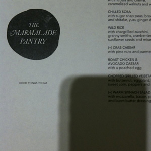
Let’s just take a look at the above example of The Marmalade Pantry’s menu which I came across last night. It looks so plain and simple, no intense graphic design, no super amazing concept, but somehow the whole thing looks fantastic. Let’s break it down and take a look at some design decisions that was considered by the designer.

  • Capitalisation – Notice how dish items are CAPITALISED to accentuate it from the description. Bold or underline was not used. This gives the whole menu a light and classy feel.
  • lower case descriptions – The descriptions are all in lower case, not sentence case as the description are not sentences at all. Instead these descriptions are a continuation of a sentence of the dish item.
  • Labels – Some dishes are labelled with a “(+)” instead of a typical “*” or small icon. Also “(+)” was used instead of “[+]” which I find is a good call as the sharp corners of “[+]” adds a bit of stress / up-tightness.
  • Spacing – Everything is well spaced and given enough white space for breathing room so that its easy for the eye and not cluttered. The content is also well away from the edge of the paper which is nice. Each line of text be it a menu item or its description also had the same line-height, this also allows multiple columns of text to line up nicely horizontally.

There are lots more items that can be talked about, the choice of font, the quality of paper, the colour of the paper, the position of the logo and the tagline, copywriting, etc.

If you think that’s all, no its not. There are also the non-design stuff that needs to be factored in.

  • Profits – Was the design of the above $5, $50, $500 or $5000? Did the designer burned his weekend doing it? Was this design job even profitable? Even Rockstars need to eat.
  • Approvals – Never have I seen a designer presenting a design to the client and the client go “this is perfectly what I wanted, good job, here is your payment, consider this project completed”. To add another level of complexity will be to get approvals from a committee of non-design people who are travelling consistently and do not want to take responsibility of giving the approval. *cough* gov *cough* clients *cough*
  • Other Agendas – Some projects are ego trips. The REAL matrix for measuring project success could be if your direct client managed to approve a design that the big boss really wanted and hence give him a raise or promotion.

I know I’m being extreme here, but I reckon you get my drift. There could be a lot of emotional investment, angst and stuff that you can’t see from a seemingly “simple” output. So dear client, when something looks simple and yet it sort of feels right, pls pls pls don’t add crap comments to it because you feel that you must give feedback to the designer you have engaged. Try  smiling and tell the designer “it looks simple, yet… somehow… FANTASTIC! I’m glad I hired you and I’m sure it’s not as easy as it seems.”

ps: the shadow is my iPhone and did you notice its nicely aligned vertically? :p