Was on the beach with Dezzo and family on saturday and like a dedicated Architect, Dezzo introduced me to Monocle, yes at the beach.
Launched in February 2007, Monocle is a global briefing covering international affairs, business, culture and design. Headquartered in London with bureaux in Tokyo, Sydney, Zürich and New York, Monocle appears 10 times a year in print and is updated constantly at monocle.com.
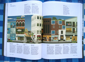
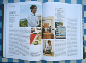
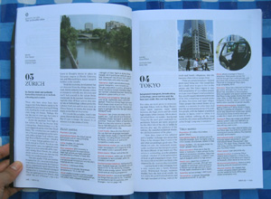
When i started browsing thru it, i immediately fell in love with its content and also its layout. Not only was content presented neatly, it felt like every page is laid out with good composition in mind. You can feel how content flows and you will not be distracted with illogical sequencing.
The use of space, the use of colours, the use of typography, the use of visual balance. Its hard to explain, you just got to see it for yourself.
After going thru every page and reading several articles, i made a point to visit its website when i got home and i’m glad the consistency carried thru even online.
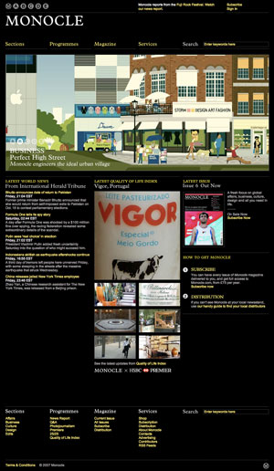
Why white base magazine and black background for its website? If the magazine is white base (for obvious less ink = cheaper to print reasons… i think…) why not have the website white background? Look at Mocoloco, Dexigner, Design Addict, iF or even the very popular Apple.com, they all are designery-ish and they all use white background.
I gave it a bit of thought and realise even blogging with my WordPress in white background is actually quite painful for my eyes. I think reading online is actually more comfortable when the website’s background colour is black. And if the text is full white, the contrast might be a bit harsh on the eyes, hence a shade of grey would fit in just nice. Its not surprising that Monocle does just that.
THIS is how a good website should be done. Maybe its just my preference, but i think websites are about its content and the design should not distract users, instead the design should facilitate users in accessing content.
Almost every other website out there is just trying to get attention by having a fancy design or by providing interesting content via aggregating other website’s original content. I’m glad Monocle not only have good content in print, but also good content for its online audience.
And yes i’ve subscribed to its RSS and i plan to redesign my website.
hmm…. new look!… hmmm
http://www.blackle.com/
the real reason for black backgrounds on monitors…
Very cool site… I am planning to re-design myself next year or so, to accommodate much more content. For now tho, I’m quite happy with wot I’ve done so far.
The background color plays a huge role actually… you are right. But the content/products/services kind of influences these colors as well… corporate types love to use white bg because well, for some reason they think that white is the only color that can portray professionalism, but that is really not the case.
This is a rather subjective subject, but personally i prefer a dark site compared to a white one… maybe it’s in my nature [see content of my site… ;)] I hate plain white walls!! haha.