Have you seen some designs and think “That looks so easy to do, i’m sure even my grandmother can do it.”. The thing is, after being in the web design business since the mid 90s with roles ranging from design to coding, pitching to convincing clients, I can confidently say its not the case.
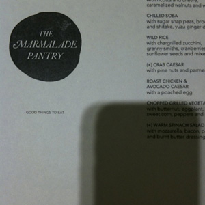
Let’s just take a look at the above example of The Marmalade Pantry’s menu which I came across last night. It looks so plain and simple, no intense graphic design, no super amazing concept, but somehow the whole thing looks fantastic. Let’s break it down and take a look at some design decisions that was considered by the designer.
- Capitalisation – Notice how dish items are CAPITALISED to accentuate it from the description. Bold or underline was not used. This gives the whole menu a light and classy feel.
- lower case descriptions – The descriptions are all in lower case, not sentence case as the description are not sentences at all. Instead these descriptions are a continuation of a sentence of the dish item.
- Labels – Some dishes are labelled with a “(+)” instead of a typical “*” or small icon. Also “(+)” was used instead of “[+]” which I find is a good call as the sharp corners of “[+]” adds a bit of stress / up-tightness.
- Spacing – Everything is well spaced and given enough white space for breathing room so that its easy for the eye and not cluttered. The content is also well away from the edge of the paper which is nice. Each line of text be it a menu item or its description also had the same line-height, this also allows multiple columns of text to line up nicely horizontally.
There are lots more items that can be talked about, the choice of font, the quality of paper, the colour of the paper, the position of the logo and the tagline, copywriting, etc.
If you think that’s all, no its not. There are also the non-design stuff that needs to be factored in.
- Profits – Was the design of the above $5, $50, $500 or $5000? Did the designer burned his weekend doing it? Was this design job even profitable? Even Rockstars need to eat.
- Approvals – Never have I seen a designer presenting a design to the client and the client go “this is perfectly what I wanted, good job, here is your payment, consider this project completed”. To add another level of complexity will be to get approvals from a committee of non-design people who are travelling consistently and do not want to take responsibility of giving the approval. *cough* gov *cough* clients *cough*
- Other Agendas – Some projects are ego trips. The REAL matrix for measuring project success could be if your direct client managed to approve a design that the big boss really wanted and hence give him a raise or promotion.
I know I’m being extreme here, but I reckon you get my drift. There could be a lot of emotional investment, angst and stuff that you can’t see from a seemingly “simple” output. So dear client, when something looks simple and yet it sort of feels right, pls pls pls don’t add crap comments to it because you feel that you must give feedback to the designer you have engaged. Try smiling and tell the designer “it looks simple, yet… somehow… FANTASTIC! I’m glad I hired you and I’m sure it’s not as easy as it seems.”
ps: the shadow is my iPhone and did you notice its nicely aligned vertically? :p